If there was a VIP of typefaces, it would be Helvetica.
But why is Helvetica so popular? Created in the 1950s by Swiss typographer Max Miedinger, Helvetica has a worldwide presence. Helvetica is named after the Latin name for Switzerland and is popular among designers for its clean, bold, and modern look.
Here is how the managing director of Linotype, the German firm that owns the rights to the typeface, describes Helvetica. Frank Wildenberg: "It's durable. It comes from natural design forms. It doesn’t have an expression of fashion. It has very clear lines and characters, it looks like a very serious typeface."
For all typography geeks, here are some great examples featuring the Helvetica font:
The signage for the New York City subway system is entirely using the Helvetica type:

It is a long story, but MTA chose Helvetica in the first place to unify their different train operations, which were using several different fonts at the time.
Additionally, Helvetica served as the perfect choice for their signage concept, as its properties supported the aim to create signs that could be quickly read and easily understood by riders.
Look around you and you will find lots of examples of where the simplicity of the Helvetica font has been used to facilitate people's lives:

Countless companies use the Helvetica font for its sleekness and timelessness, and as a way to convey their brand message:
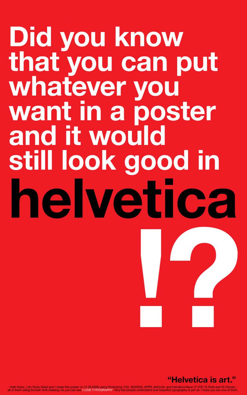
This poster totally proves a point:
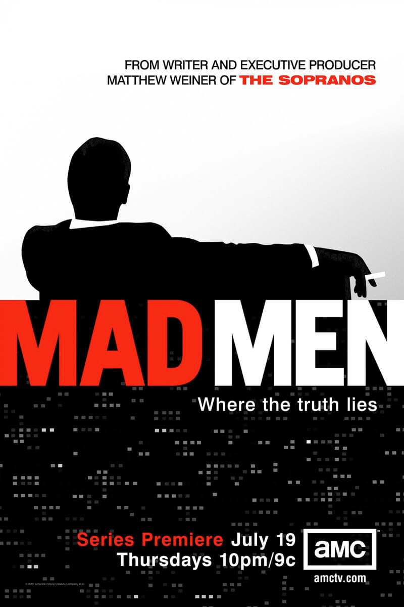
The poster of the popular TV show MAD MEN uses a typeface close to Helvetica Neue Heavy:
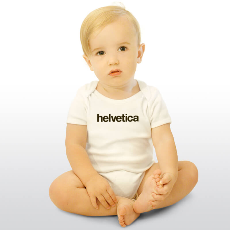
How about this adorable Helvetica onesie for your baby?
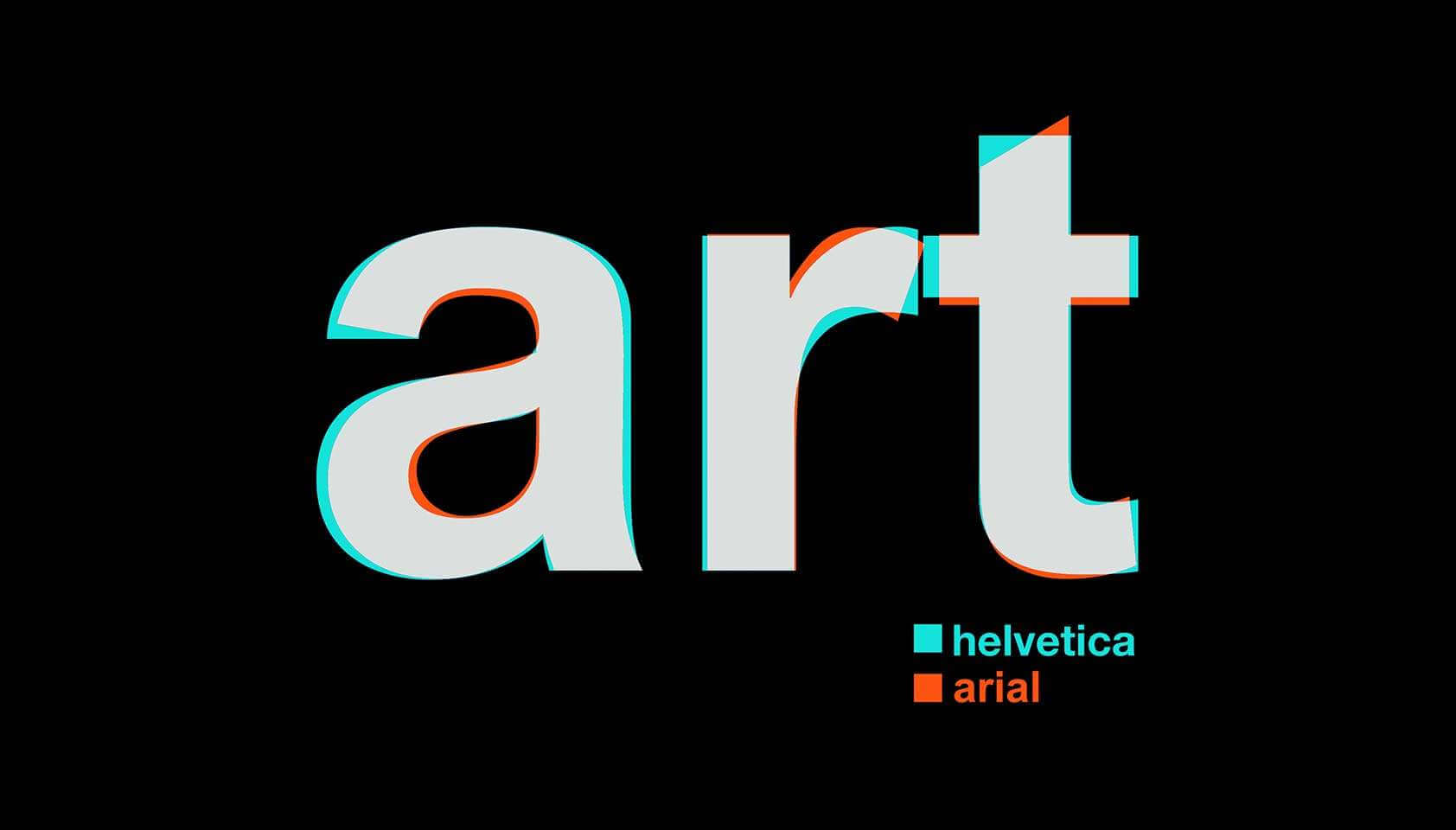
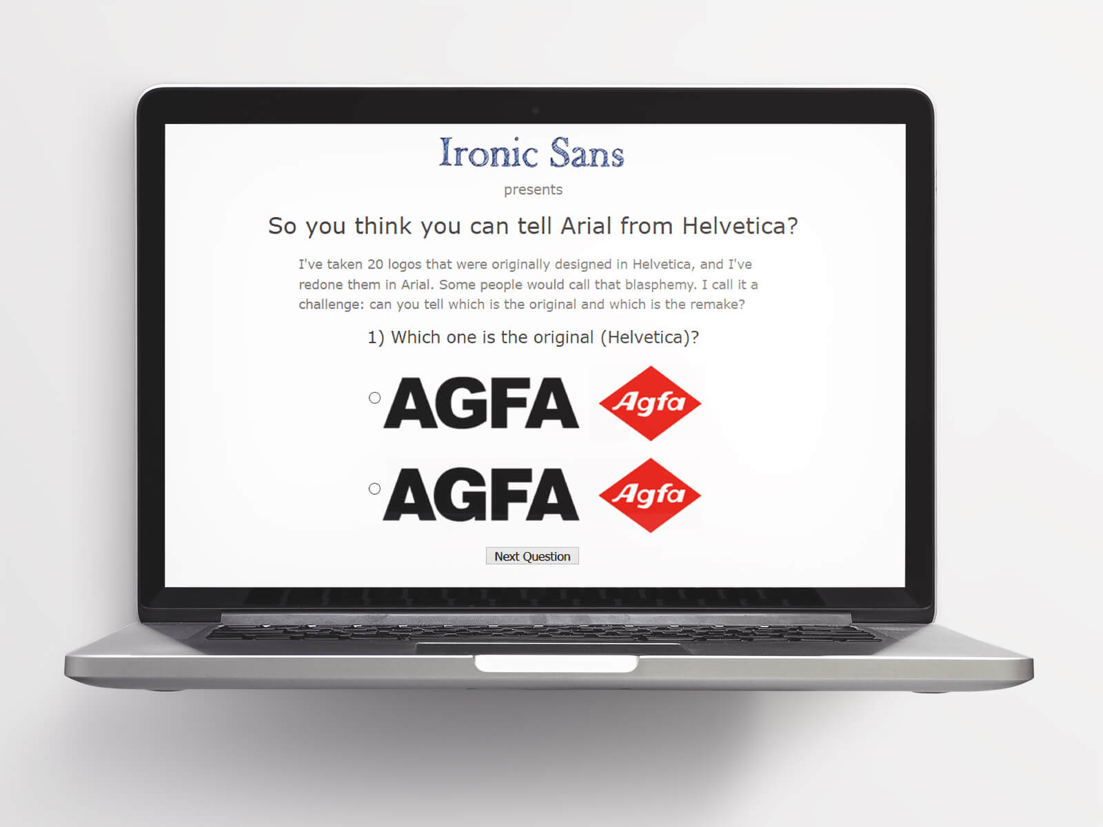
There is quite a difference between the Helvetica typeface and the Arial typeface...
The devil is in the detail. Check out this helpful design guide to learn how to spot the difference!
Can you tell Helvetica and Arial apart? Take the quiz to find out!
More information about the Helvetica font face
- Purchase the Neue Helvetica typeface from Linotype
- Watch the Helvetica documentary on Vimeo
- Buy the most popular Helvetica books on Amazon


[…] typeface Helvetica was created in Switzerland, which might be surprising unless you knew that "Confoederatio Helvetia" […]
[…] students use Times New Roman for their assignments, but it’s not uncommon to use a font like Helvetica (the default in the program Pages) or Georgia, or even Cambria. But now, let’s expand a little. […]
[…] the Swiss design the country is famous for. Expect photography used in conjunction with typography. Helvetica and Univers are the typefaces of choice, with the typography expertly kerned and arranged […]